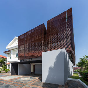
Peirce Hill Villa Extension The expansion of a family from bi-generation to tri-generation necessitated the extension of this luxury detached housing in Singapore. The extension was conceived as an independent domestic space, centred around a new living room, 3 bedrooms, a study, multiple terraces and courtyards, and a rooftop garden, whilst the kitchen and garage are shared with the original house. The new living room, which forms the heart of the extension, is converted from a bedroom in the original house, metaphorically and literally linking the two families. The Question of Luxury The site was originally a hill with a large conserved house that was bought over by a luxury developer, who subsequently divided the lot into 30 large mansions. The area is gazetted as a “good-class bungalow area” (GCBA) in Singapore, the most prestigious private residential category with severe limitations on minimum lot size, set-backs and buildable area. Each of the 30 houses was themed – “Palm Beach”, “Fontainebleu”, “Beverly Hills”, “Majorca” etc., – creating a paradoxical constellation of imagined global luxury meant to appeal to potential buyers. The mansions were thus post-modern in style – the general massing, programmatic distribution and parti of the houses varied little, but the exterior walls were heavily ornamented with pediments, cornices, and embellishments not only to differentiate the dwellings, but also as signifiers of “luxury”. The ornamentation was not only limited to the exterior – on the inside of the house, bull-nose counters, balustrades, wainscoting and such were used to connote luxury and exclusiveness. The Crenulated Envelope The “ornamental-envelope-as-luxury” was thus the starting point for the design of the extension, which was envisioned as an outgrowth of the wall of the original building. However, rather than having crenulations simply as ornamentation, the walls fold in and out to define new rooms and spaces, and to provide cross ventilation for each and every space – a “luxury” not to be found in the original house. Both levels of the new construction can be read as spaces created by the ribbon-like extension of the wall, with the second floor floated off the ground floor to keep them tectonically distinct. The ground level extension was also painted with grey stucco to contrast with the upper floor, whose base colour was intentionally kept identical with the original building. The play on the depth of the wall was further emphasized by the dramatic rain screen applied to the living spaces on the second floor. This added steel-and-engineered wood layer variously cleaves to and separates from the masonry wall to create a myriad of effects – these include shielded terraces, a catwalk balcony at the west side of the house, privacy screens, framed views, sunshading etc. Where needed, these large panels 5.5m in height fold open to allow users to control interior lighting and airflow conditions. In other words, the depth of the wall no longer served as a medium simply for decorative and stylistic appliqué – depth was now performative, and served to regulate and condition inhabitation. Nature and Environment It was the ambition of this project to provide the inhabitants, and in particular the four young grandchildren, as much access to greenery and nature as possible. As one traverses the spaces of the new construction, a series of choreographed vignettes to nature is presented – from a small patch garden that extends under the main stairs, to the large rain-screen panels that open up to frame the exterior; from the newly created pocket gardens that sit between the old and new houses, to the terraces and glass roofs that focus views skywards. The sequence culminates in the roof top garden, which acts as a promontory to view the lush greenery of the surroundings. Environmentally, the house also used passive technology to reduce its energy load. Various gaps between the old and new construction result in vertical shafts that facilitate air flow, while the spaces are all cross-ventilated, thereby reducing the reliance on air conditioning. The slats on the screen were designed with 6 angles not only to confer dynamism on the façade, but were carefully calibrated based on different environmental needs – shading, privacy, views to the exterior etc. Large portions of the extension were also designed to be semi-outdoor spaces, from the garage, to the utility areas and the entrance stairway. Due to structural loading and budgetary limitations, the roof top garden could not be planted, instead borrowing the greenery from the lush surroundings. However, the decking and rocks served to reduce heat gain commonly associated with large flat roofs. Rethinking Luxury The Peirce Hill Extension started with the question of “luxury” – one that was seemingly displaced from the context of tropical Singapore, and which was founded on stylistic notions of imagined foreign locales. The design for the new construction eschews the question of style altogether, focusing instead on performance and experience; indeed, the extension does not attempt to emulate or blend in with the old. Neither does the design call for the removal of all traces of ornamentation in the original building, but rather, to treat these as found conditions that instigated a response. Instead, this project attempts to frame critique – of the constructed notion of luxury through ornamentation – as productive design act. The new and the old, one growing out of the other, are put in dialogue with each other.
Peirce Hill Villa Extension
Singapore
330sqm
Design Categories:
Research Categories:
Recognition:
International Architecture Awards, The Chicago Athenaeum, 2024
Singapore Institute of Architects
Design Awards, 2022
Publications:
ARCASIA, "Reflection on Nature", Architecuture Asia, Mar 2024
Suan Ching, Tay, "Living Large", The Business Times, Sep 2, 2022, Singapore
Related Projects:
Chuan Garden Extension Phase II
Chuan Garden Extension Phase I


